
This post is speculation, but based on facts. I do not know any more than the rest of the player base for what actually is getting announced January 24th at PAX South. (In short, I could be wrong)
Yesterday I said that the logo alone confirms that Guild Wars 2: Heart of Thorns isn’t the next Living Story season, nor is it a small content patch. It’s a full-blown expansion.
On the face of it, this sounds absurd, but ArenaNet’s art department is one of the best in the business, and they are scarily consistent with their presentation of the various aspects of the game from the painterly look of the cinematics, to the art of the open world, to even their typography (the display of letters, typically via fonts).
Because of this consistency, it is obvious to me that Heart of Thorns is an expansion, and nothing less.
NOTE: All logos used under fair use. Also, WordPress makes all of my images smaller than they actually are, so clicking for more detail is highly suggested.
But Living Story Had Logos!
Like the one on this page!
They did, up until the beginning of 2013 (though Festival of the Four Winds got a logo again). Then they switched to a simple serif font, with the only “logo” aspect of it being the use of multiple heights and sizes.
Also, never, at any point did they use Guild Wars 2’s distinctive logo font:
![]()
I checked, not a single release uses anything remotely close to the “missing pieces” title font.
Yet Heart of Thorns boldly and obviously uses it, both subtitle and title.
Consider the Dragon Head
As a second point, look at what happens when the new Heart of Thorns logo is overlaid on the original logo:
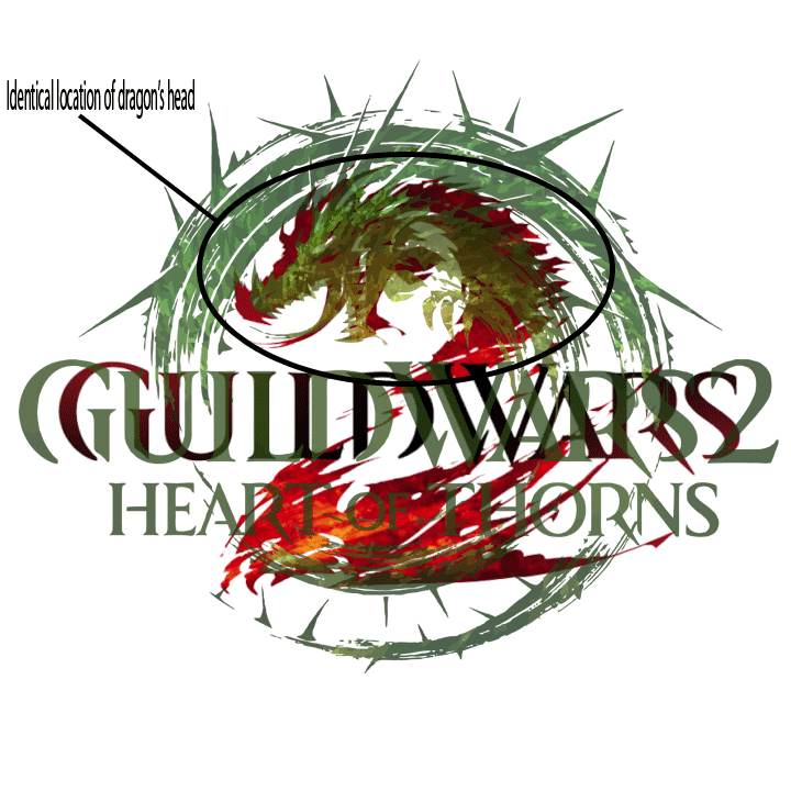
Not just identical in location, but almost identical in shape and features of the head, the few changes being the addition of thorns to the back of the head, and a slight shortening of the snout.
Granted, the Guild Wars 2 dragon has no claws, favoring the look of wings from the base of the “2”, but I’ll get to that.
Similar Color Shifting
Thirdly, compare the original Guild Wars 2 logo and the new Heart of Thorns one:

One subtle thing on both is the deliberately restricted color palette. The original is allowed primarily shades of red, with a touch of orange and yellow (alluding to fire, the typical element associated with dragons), with a “reading comprehension” black shade for “ILD WAR”. More importantly, the shades change most at the point of visual “action”: the wings.
Heart of Thorns has the same restriction to a specific color of green, with only some deviation into yellow (again, to allude to the jungle/plant nature of Mordremoth). Just like in the original logo, that deviation happens at the point of “action”: the coiling dragon and its claws reaching for the “heart” of the image.
Original Expansions
Fourth, the original Guild Wars expansions had their own form of consistency: the subtitle centered (and smaller in size) below the full title of the original game. Consider:

The primary typography focus is on the original game first, then the name of the expansion second. This is very common in many things, especially game expansions. (World of Warcraft takes this to next levels by using the exact same look for every single expansion, only shifting the color palette and adding minor motifs to the edges)
Animation Motif
Finally, consider the animation motif at the end of the trailer. First, here’s the Point of No Return trailer we just got:
Absolutely zero animation. Just text that fades in and out.
Now, look at the original Guild Wars 2 animation:
Really cool, with the “2” forming by what appears to be fire spreading across the screen along the frame of it.
Compare to the new Heart of Thorns animation:
Way, way different.
How does all this confirm an expansion?
Two words: time and effort.
Crafting a very specific and exacting logo takes effort, with a particular eye for constraints and detail that a lot of concept art doesn’t have to worry about. (Bonus points: want an easy way to make an art major rip their hair out? Tell them they can only use 5 shades of the same color in a composition)
Going beyond that, having a specific animation (with the exact same restrictions) tied to a logo takes a lot of time. Time that the development team hasn’t utilized (nor needed to) with the Living World. Heck, Living World itself still has the same logo as when it started, with the “Season 1/2” placed beneath.
Why would ArenaNet ask some of its artists to sit down and put in a large amount of effort toward a new Living World season? (For that matter, why change the formatting from Living World Season 3: Subtitle to Guild Wars 2: Heart of Thorns?)
Consider the trailer separate from its place at the end of the Point of No Return. What does it look like? Full game trailer, making a bold starting statement, explaining the many plot threads hanging in the air, showing characters and attitudes that will factor into the story, and a bold ending statement of purpose.
Even outside the context of Living World Season 2, that trailer makes sense. Heck, even outside the context of Guild Wars 2 itself, that trailer makes sense. Why would ArenaNet need a trailer and logo that makes sense without any context? Expansion.
I do have to give credit to ArenaNet’s art department (again) for being so amazingly good at their job that their efforts give away what’s coming next.

Well turns out you were correct after all. 😉
LikeLike